Creating a peaceful and relaxing environment at home often begins with the colors you choose for your walls and décor. Calm colors can transform your living spaces into havens of tranquility, helping reduce stress and promote well-being. Whether you want to refresh a single room or redesign your entire home, understanding how to choose calm colors can make all the difference.
In this post, we’ll share useful tips for selecting soothing hues that create a serene atmosphere.
Why Choose Calm Colors for Your Home?
Colors influence our mood and energy levels in subtle but powerful ways. Bright, bold colors can energize and excite, while calm, muted tones tend to soothe the mind and body. Incorporating calm colors can:
– Promote relaxation and restfulness
– Help improve focus and reduce anxiety
– Create a timeless and elegant look
– Make spaces appear larger and airier
By thoughtfully selecting calm colors, you can design spaces that feel welcoming and balanced.
Popular Calm Color Families to Consider
Before diving into tips, here are some calm color families that are often used in peaceful interiors:
– Soft Blues: Light and muted blues evoke the sky or the sea, fostering a sense of calm.
– Gentle Greens: Inspired by nature, green shades bring freshness and balance.
– Warm Neutrals: Beiges, taupes, and creams offer warmth without overwhelming the senses.
– Pale Grays: Light grays add sophistication while maintaining a tranquil vibe.
– Pastel Shades: Soft pinks, lavenders, and peaches can subtly soothe and add warmth.
Tips for Choosing Calm Colors
1. Consider the Room’s Purpose
Think about how you use the room. Bedrooms and bathrooms benefit from soft, restful colors like pale blues or muted greens to support relaxation. Living rooms might include warm neutrals where family members gather comfortably. Home offices can use calming tones that encourage focus, such as gentle grays or subtle greens.
2. Test Colors at Different Times of Day
Lighting impacts how color appears. Test paint samples on your walls and observe them in morning, afternoon, and evening light. Natural light will enhance blues and greens, while artificial lights can warm up neutrals or soften pastels. This helps avoid surprises and ensures the color feels calm under all lighting conditions.
3. Use Matte or Satin Finishes
Glossy paints reflect more light and can feel bold. To keep the calm effect, opt for matte or satin finishes that gently diffuse light and create a soft, welcoming look.
4. Pair Calm Colors with Natural Materials
Complement calm colors with natural textures like wood, stone, or woven fabrics. These elements add warmth and interest without overwhelming the space. For example, pairing a gentle gray wall with warm wooden furniture creates a balanced, cozy feel.
5. Limit the Number of Colors per Room
A simple color palette maintains calmness. Choose two to three main colors per room to avoid visual clutter. Use one color for walls, another for larger furniture pieces, and a third for accents like throw pillows or curtains. This cohesive approach promotes a serene atmosphere.
6. Use White and Off-White as Neutral Balancers
White, cream, and other off-white shades act as excellent neutral backdrops that amplify calm colors. They also brighten spaces, helping rooms feel open and airy while maintaining tranquility.
7. Add Depth with Accents
Calm colors don’t mean boring! Use deeper shades or textured elements as accents to add depth and interest. A deeper blue throw blanket, a muted green vase, or soft pink artwork can enhance a room’s character without disrupting the peaceful mood.
8. Avoid Harsh Contrasts
High contrast, such as pairing bright white with black or bold colors, can create visual tension. Stick with soft, harmonious shades so your eyes can rest comfortably in the space.
How to Incorporate Calm Colors Beyond Paint
While wall color sets the tone, calm colors can be brought into your home through other details:
– Textiles: Choose curtains, rugs, cushions, and bedding in calming tones or subtle patterns.
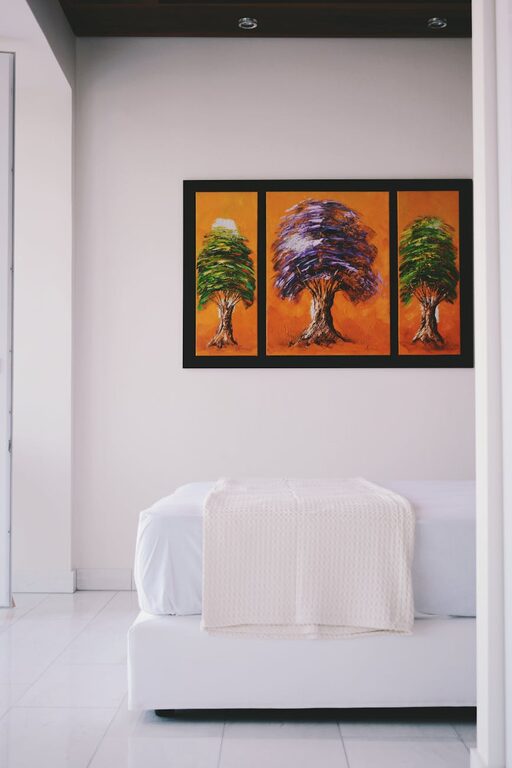
– Artwork: Select pieces with soft color palettes or nature-inspired themes.
– Plants: Greenery naturally adds relaxing colors and freshness to any room.
– Furniture: Opt for wood or upholstery in muted hues to complement your chosen colors.
Final Thoughts
Choosing calm colors for your home is a wonderful way to create inviting, stress-free spaces. By thinking about your lifestyle, testing colors carefully, and combining hues thoughtfully, you can design rooms that support relaxation and comfort every day. Remember, a calm home is a happy home!
Happy decorating!