Creating a peaceful and relaxing environment in your home starts with the colors you choose. Calm colors can transform your space, making it feel more inviting and serene. Whether you want to refresh a single room or redesign your entire home, understanding how to select and use calm colors effectively is key. In this post, we’ll explore practical tips for choosing calm colors that help bring tranquility and balance into your living space.
Why Choose Calm Colors?
Calm colors are generally those that promote relaxation and reduce stress. Often found in nature, these colors include soft blues, gentle greens, muted neutrals, and warm pastels. They create a soothing atmosphere that can improve mood and make your home feel like a sanctuary.
Different people may find various colors calming, so understanding your personal preferences is important. However, the principles behind calm colors focus on subtle hues that avoid harshness or overstimulation.
Start with Neutral Foundations
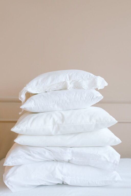
Neutral colors are the perfect base for any calming color scheme. Shades like beige, ivory, soft gray, and pale taupe set a serene backdrop without overpowering a room. They work well on walls, larger pieces of furniture, and flooring.
Benefits of Neutrals:
– Easy to pair with other colors
– Create a timeless and elegant look
– Enhance natural light, making spaces feel brighter and more open
If you’re unsure where to start, consider painting your walls a light neutral tone and then adding calm accent colors through accessories or smaller decor items.
Use Nature-Inspired Colors
Look to nature for color inspiration. Many calming colors are found in natural elements, such as:
– Soft blues: like a clear sky or calm ocean
– Greens: reminiscent of leaves, moss, and vegetable gardens
– Earth tones: like sandy beiges, soft browns, and gentle terracotta
These colors help create a connection to the outdoors, which can be grounding and soothing. Using nature-inspired palettes encourages balance and harmony within your home.
Consider Color Psychology
Color psychology studies how colors affect our emotions and behaviors. Calm colors tend to evoke feelings of relaxation, safety, and refreshment. Here are some popular calm colors and their typical effects:
– Blue: often associated with tranquility, trust, and peace
– Green: linked to renewal, growth, and calmness
– Lavender: conveys calm and spirituality
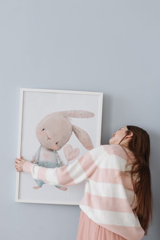
– Soft pinks and peaches: provide warmth without overstimulation
– Gray: neutral and balanced, ideal for subtle sophistication
Recognizing the psychological impact can help you choose colors that promote the mood you want in each room.
Balance Color with Light
Lighting plays an important role in how colors appear. A color that feels calm in natural daylight might seem dull or too dark under artificial light.
Tips for balancing color and light:
– Test paint samples on your walls before committing
– Observe colors at different times of day with varying light sources
– Use sheer curtains or light window treatments to maximize natural light
– Incorporate soft white or warm LED bulbs to complement your chosen hues
Good lighting enhances calm colors, making spaces feel more open and welcoming.
Mix Warm and Cool Tones
Calmness doesn’t mean cold or boring; a thoughtful mix of warm and cool tones can bring depth and interest to your decor without overwhelming your senses.
– Pair cool blues or greens with warm beige or light wood accents
– Use soft peach or blush hues alongside pale gray or mint green
– Add textured fabrics or natural materials like wool, cotton, or linen for tactile comfort
This balanced approach helps maintain a cozy yet fresh atmosphere in your rooms.
Use Color in Layers
Instead of painting every wall with the same color, consider layering colors through the room’s elements:
– Walls and ceilings in soft neutral or cool shades
– Furniture in complementing calm colors
– Accent pillows, rugs, and curtains to introduce subtle contrasts
– Artwork and decorative pieces in harmonious tones
Layering colors allows you to personalize your space and maintain visual interest while keeping the overall look serene.
Keep It Simple
Avoid overly bright or bold colors, which can be stimulating and clash with a calm environment. Likewise, steer clear of too many competing colors. Stick to two or three calm shades per room to create a cohesive and peaceful look.
Minimalism often pairs well with calm color schemes. Simple, uncluttered spaces help emphasize the soothing effect of the colors you choose.
Sample and Test Before Deciding
Choosing paint is a big decision. Color swatches and chip cards are helpful, but seeing colors in your actual rooms is best.
How to test colors effectively:
– Purchase small sample pots of your favorite shades
– Paint a small section of wall or a large piece of poster board
– Observe the color at different times and lighting conditions
– Live with it for a few days before committing
This approach saves time and prevents costly mistakes.
Final Thoughts
Selecting calm colors for your home isn’t just about aesthetics; it’s about creating a sanctuary where you feel comfortable and refreshed. By starting with neutral bases, incorporating nature-inspired palettes, balancing light, mixing warm and cool tones, and testing samples, you can design spaces that promote peace and relaxation.
Remember, the best calm colors are those that resonate with you personally. Take your time, enjoy the process, and let your home become a true reflection of tranquility.
—
We hope these tips inspire you to create a soothing and inviting environment with calm colors you love!